That color you picked three years ago? The one that looked perfect on the tiny swatch at the store? Now it feels like it belongs in someone else’s house. If you’re considering interior house painting in Port Matilda, PA, you’re not alone in wanting something that won’t leave you second-guessing your choice by next winter.
Here’s what’s shifting in the 2026 interior paint color trends: homeowners are done chasing bold statements. They want colors that make their homes feel like home—not like a design experiment that aged poorly.
Sherwin-Williams heard that loud and clear. Their 2026 Color of the Year, Universal Khaki (SW 6150), isn’t trying to impress anyone. It’s trying to work. And that’s exactly why it matters.
Key Takeaways
The Real Reason Sherwin-Williams Chose Universal Khaki
Paint companies don’t guess. Sherwin-Williams has a Trendsight Team dedicated to tracking what’s happening in design, culture, and how people actually live in their homes. When they chose Universal Khaki, they weren’t picking a color. They were responding to a mood.
Sue Wadden, Director of Color Marketing at Sherwin-Williams, described it as “understated and hardworking.” That’s not marketing fluff. It’s an acknowledgment that homeowners have grown exhausted by colors that demand constant coordination.

Universal Khaki sits in the middle ground. It’s a midtone neutral with warm, earthy undertones—close to tan but without the yellowish push that makes some khakis feel dated. It reads as calm. Grounded. Like a room that’s been lived in by people who have good taste but don’t need to prove it.
For anyone tracking 2026 interior paint color trends, the headline is: the era of trying too hard is over. What’s replacing it? Colors that let your furniture, your art, and your life take center stage.
Nine Colors Built to Work Together
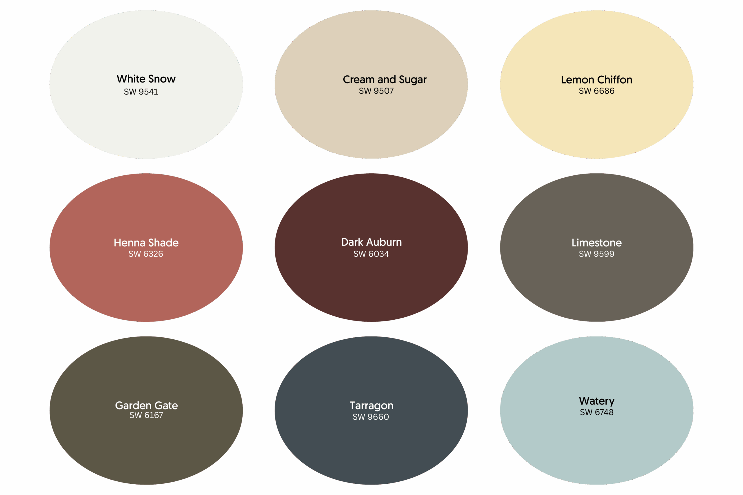
Universal Khaki doesn’t stand alone. Sherwin-Williams paired it with nine coordinating shades, giving homeowners a full toolkit for every room in the house. The goal isn’t to use all of them—it’s to have options that won’t clash no matter which ones you pick.
Here’s what you’re working with:

These nine colors form a system. Mix and match across rooms, and your home still feels connected. That’s the point.
Why These 2026 Interior Paint Color Trends Fit Port Matilda Homes
Central Pennsylvania has a rhythm. Cold winters that stretch longer than you’d like. Summers with humidity that softens everything. And light that shifts dramatically between seasons—bright and sharp in July, muted and gray by December.
Your paint colors live inside that rhythm. What looks warm and inviting in August might feel heavy and dark in February. What seems fresh in spring could wash out under summer’s intense afternoon sun.
Universal Khaki handles these shifts. It’s warm enough to feel cozy when snow piles up outside, but neutral enough to stay balanced when sunlight floods through the windows. The 2026 interior paint color trends favor exactly this kind of adaptability. Colors that perform across conditions, not just in ideal lighting.
Port Matilda homes often feature natural materials, such as hardwood floors, stone fireplaces, and wooden beams. Universal Khaki and its supporting palette lean into those elements rather than competing with them. An experienced interior painter can show you how these colors enhance what your home already has, rather than fighting against it.
What a Professional House Painter Brings to the Table
Choosing the right color is half the battle. Applying it correctly is the other half—and that’s where most DIY projects fall apart.
An interior house painting professional handles the details you might not think about:
Colors like Universal Khaki reveal every flaw in application. Mid-tones don’t hide mistakes the way dark colors or bright whites sometimes can. When an interior painter applies this shade correctly, it looks rich and dimensional. When it’s done poorly, it looks muddy and uneven.
That gap between “looks amazing” and “looks like a DIY job” is exactly what hiring the right professional house painter eliminates.
The Cost of Putting It Off

Here’s something homeowners don’t always consider: waiting costs money.
Those scuff marks on the hallway walls? They’re getting worse. The faded paint in the living room? It’s making your furniture look older than it is. Every month you delay, the prep work grows. Small touch-ups become full room repaints. Simple fixes become complicated repairs.
And there’s the less tangible cost. Walking into a room that feels tired or dated affects how you experience your own home. You stop inviting people over. You notice the flaws every single day. The space that should recharge you ends up draining you instead.
The 2026 interior paint color trends offer a clear path forward. Warm neutrals. Coordinating palettes. Colors are designed to age gracefully. If your walls are working against you, this is the year to fix it.
Your Port Matilda Home Deserves to Feel Right
You spend more time in your home than anywhere else. The colors on your walls shape how every room feels—whether you notice it consciously or not.
Interior house painting in Port Matilda, PA, doesn’t have to be stressful. With the right colors and the right team, it becomes one of the fastest ways to fall back in love with your space.
Marker Enterprises works with Port Matilda homeowners who want results they can trust. No cutting corners. No guessing games. Just professional interior house painting that makes your home look the way you’ve been picturing it.


